Brand / Identity
WavePrintUs
Identity, e-commerce storefront, and product presentation for a commercial print brand: a visual system designed all the way through to press-ready production.
- Year
- 2025
- Role
- Brand, Web & Production Designer
- Tools
- IllustratorPhotoshopInDesignSvelteKit
- IDENTITY
- 4C PROCESS
- WEB + PRESS
The problem
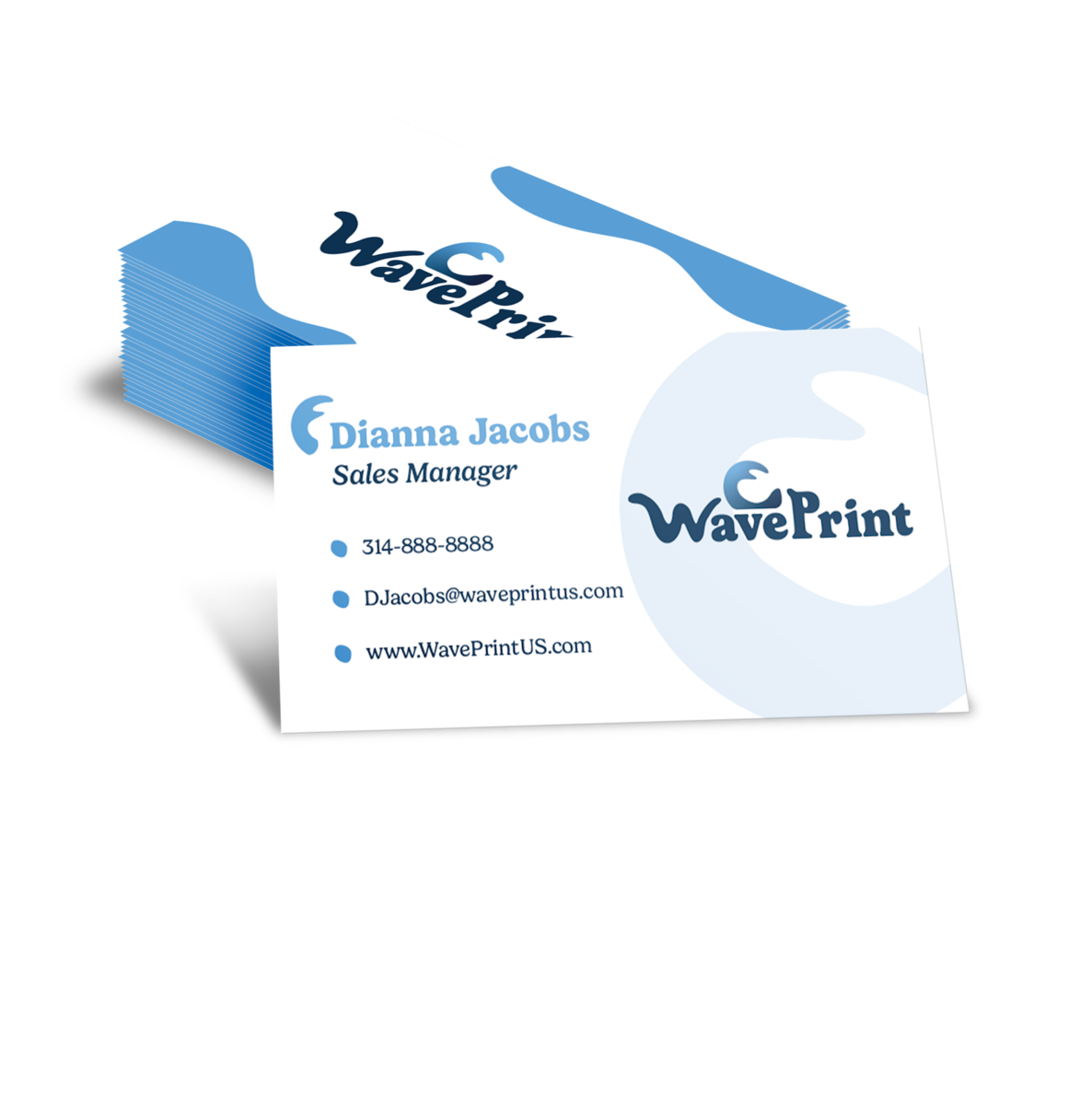
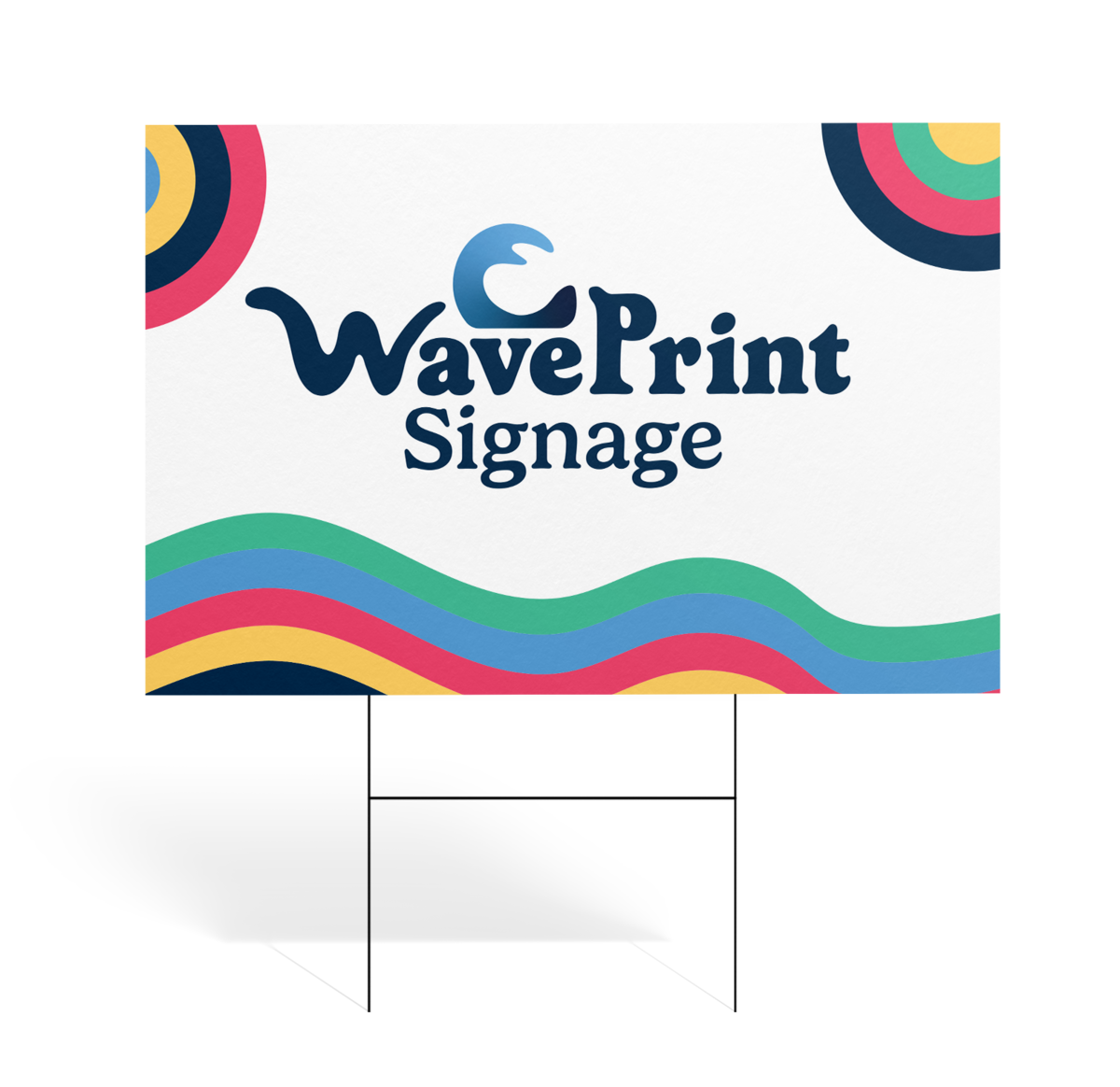
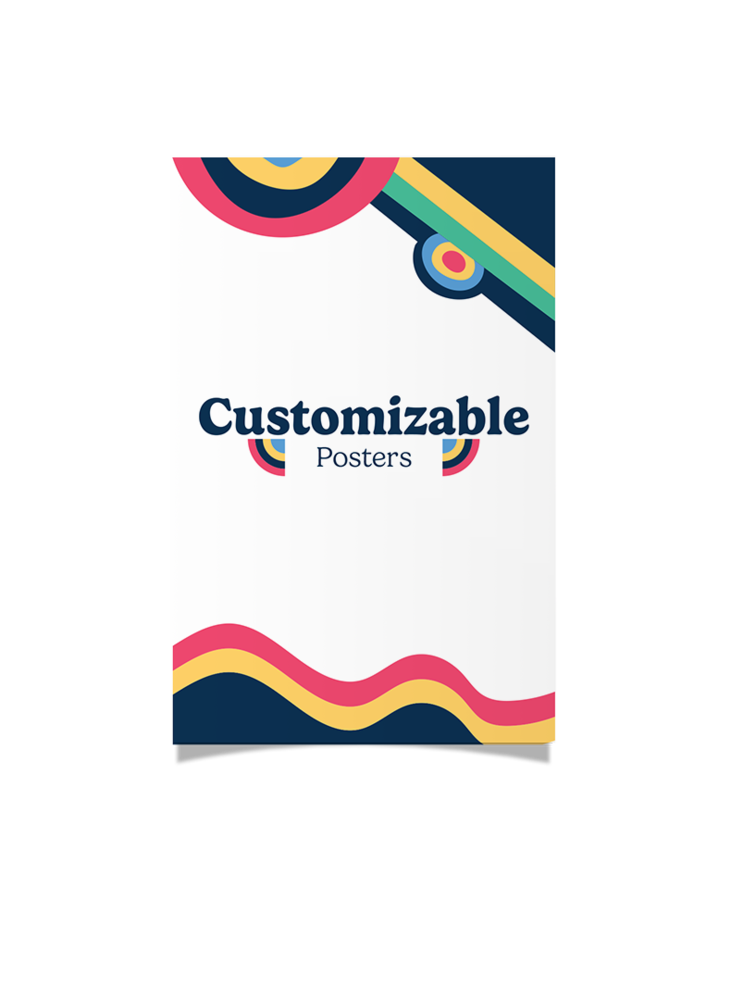
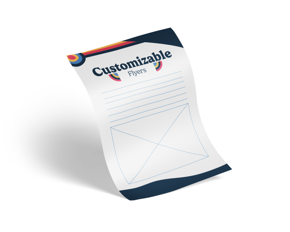
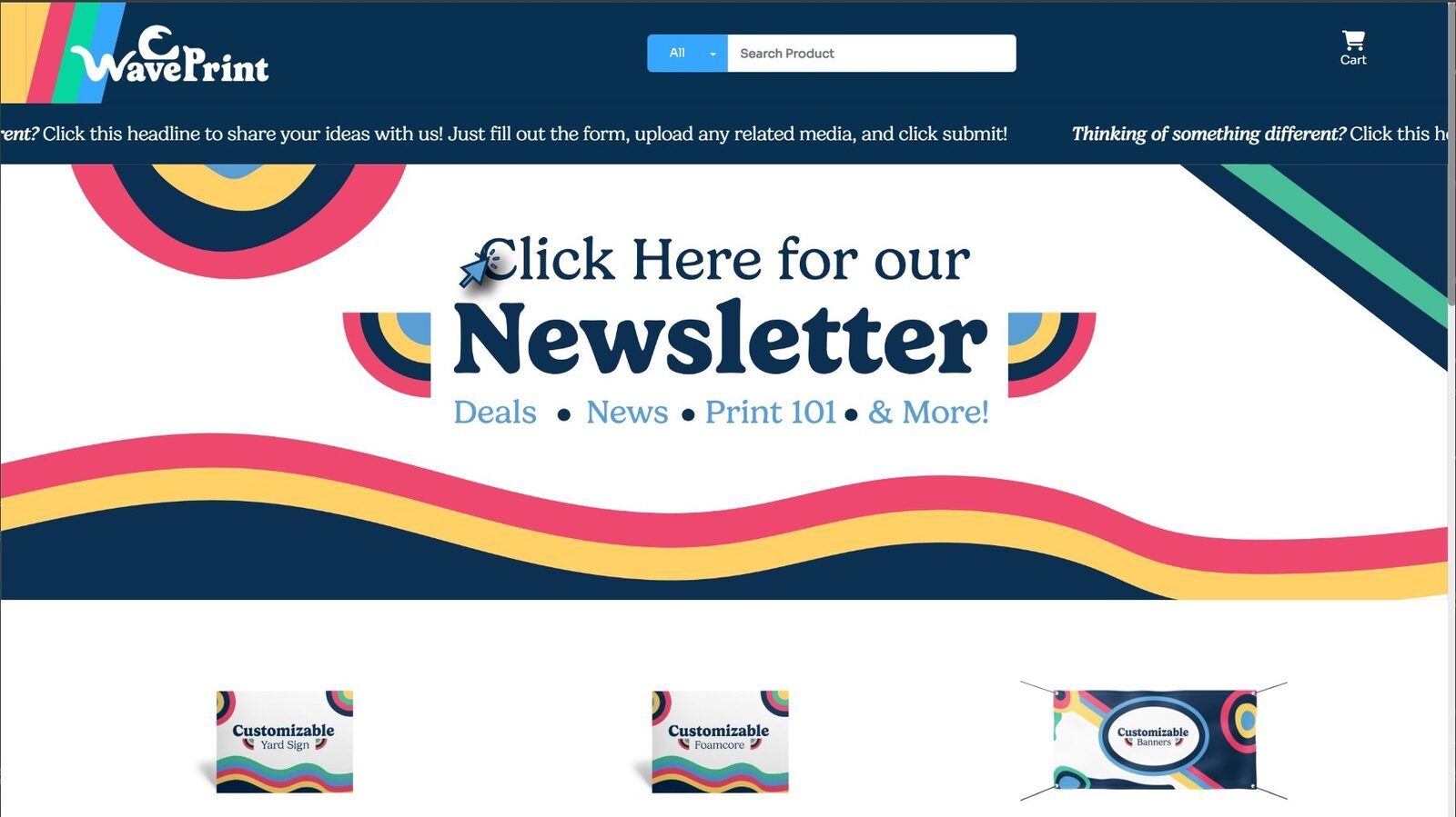
A commercial print brand needs one identity that holds together across a big catalog: business cards, postcards, posters, signage, banners. It also needs a storefront where non-designers can browse and order without the brand falling apart. The design has to look right on screen and still land press-ready on the floor. The client wanted the brand to feel a little nostalgic, so I leaned into a late-80s / early-90s aesthetic: flamboyant color, a campy-but-charming marketing voice, and a real focus on making things easy for the customer. That spirit shaped the branding and set the tone for the whole site.
The approach
I built the brand from the ground up: a logo suite around the WavePrint wave mark (color, white, favicon, standalone), a product and collateral system, and the e-commerce storefront that houses it all. I designed the identity and the storefront together, so the on-screen experience and the printed product read as one brand.
Production detail
The catalog scopes everything the parent company (Bender Inc.) already prints for its B2B customers. The initial, non-custom WavePrint products are built ad hoc on well-established item templates, so they plug straight into the existing printing pipeline while holding to print standards: bleed, trim, CMYK color conversions, and press-ready geometry throughout.
Outcome
The brand and storefront are live at waveprintus.com. The catalog now runs on 150-plus item templates built from 11 base ad-hoc projects, and the branded Facebook account picked up over 1.6k follows in its first two weeks.
See it live